
Help me pick a new look for Okopipi Software
I'm redesigning my consulting website and have three directions. Have a look at each one (they all work on phones too) and tell me which you'd pick if you were hiring a software consultant.
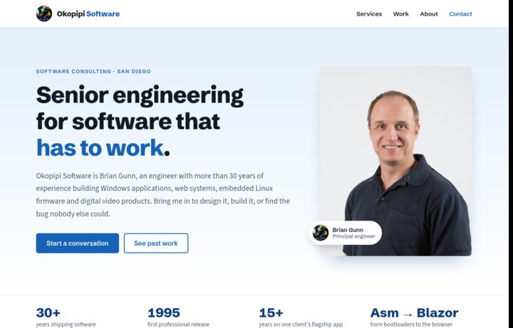
Option A
Azure
Clean and light, like an established consulting firm. Real photo and a classic layout.
View option A →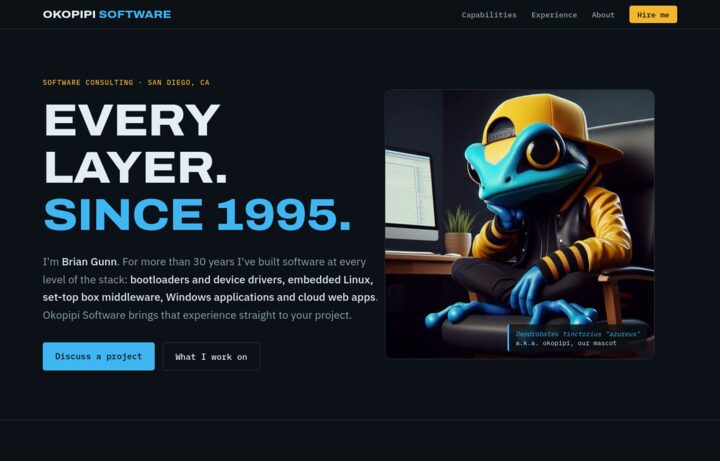
Option B
Nightshift
Dark and technical, led by the frog mascot, with a full-stack diagram and a career timeline.
View option B →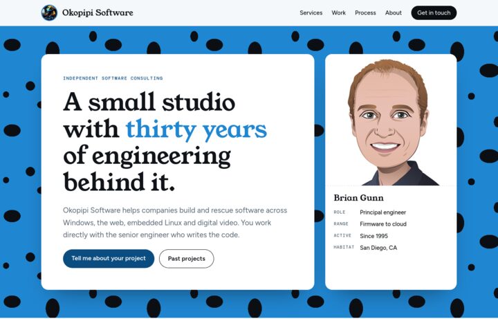
Option C
Field Guide
Friendly small-studio style with frog-skin spots and an illustrated portrait.
View option C →What I'd love to hear: which option you prefer, anything that felt off or confusing, and anything you'd borrow from the other two. Send your thoughts to brian@okopipisoftware.com.